7 UX Strategies to Create a Booking Website Users Love

Your website visitors are ready to book but if your booking process is complicated, slow or unclear, they’ll bounce quickly.
Just remember this statement: the easier it is to book, the more bookings you get. Don’t give any unwanted surprises. You just need simple and clustter free UX that converts.
That’s why, here we’ll show you 7 simple UX strategies that will make your booking website intuitive, fast and downright enjoyable for your customers.
Follow them to create a booking website that your visitors won’t just browse, they’ll book.
TL;DR. A well-designed booking website should make scheduling simple and fast. Using UX strategies like step-based booking flows, mobile-first design, real-time availability, and clear confirmations helps increase conversions and improve the overall booking experience.
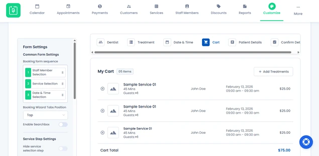
Strategy 1: Make the Booking Flow Visual and Step-Based
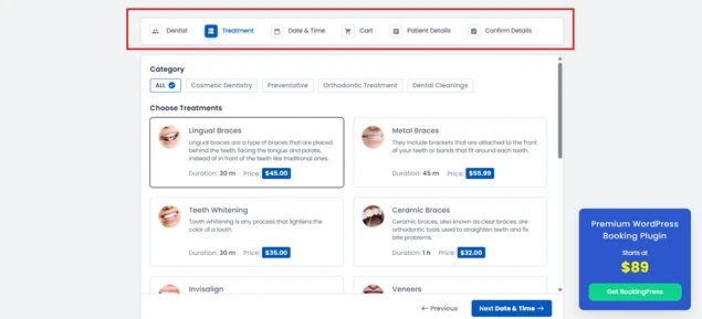
Confusing booking forms are the fastest way to lose a potential client. When your visitors see a long, cluttered form, they get frustrated, and in most scenarios, they just leave.
The solution? Break your booking process into clear visual steps. Think of it like a progress bar showing:
- Select Service
- Choose Date & Time
- Enter Details
- Confirm Booking
Visual cues like numbered steps, progress bars or even subtle animations guide users naturally through the process.
If you’re using BookingPress, you can create a multi-step booking form using a simple drag and drop interface. The plugin lets you set up step-based booking flows as you want, fully customizable, so your customers always know where they are in the booking journey.
Plus, it automatically remembers choices if someone navigates back.
A step-based flow not only improves UX but also lowers abandoned booking rates, increases trust and makes your website feel professional.
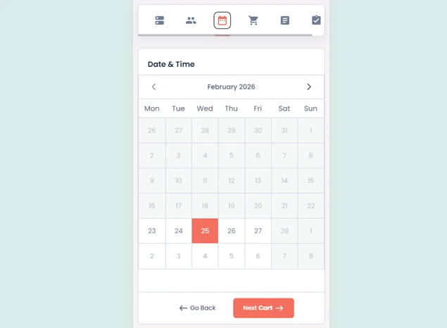
Strategy 2: Show Real-Time Availability Clearly
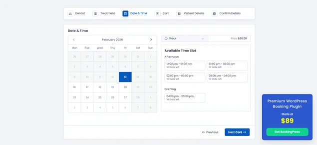
Nothing frustrates a visitor more than picking a date and time, only to find out it’s already booked. Confusion kills conversions faster than anything in the service business.
The key is real time availability. Your booking website should always clearly show what slots are open.
To create a booking website with real time availability, you can use BookingPress. This WordPress plugin lets you show live availability right on your booking form.
Visitors see which dates and times are free right away and unavailable slots are automatically grayed out. This prevents errors as well as builds trust, because your customers know the schedule they see is 100% accurate.
When users can book easily, they’re far more likely to complete the booking process, and you’ll see fewer abandoned bookings and happier clients.
Strategy 3: Build Trust with Transparent Information
Visitors don’t book an appointment if they feel uncertain about what they’re getting. Hidden fees, poor service descriptions or unclear policies create hesitation and hesitation simply kills conversions.
That’s why transparency at every step matters.
Make sure your customers know exactly what they’re booking, how much it costs and what to expect. When creating your services, make sure to show all this information right on your booking form:
- Clear service descriptions.
- Accurate pricing.
- Taxes upfront.
- Cancellation, rescheduling and refund policies.
Each service should have a detailed description, high-quality images and an even duration, so your customers don’t need to hunt for answers elsewhere.
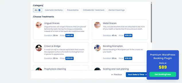
Strategy 4: Use Visual Cues and Icons for Services
Ever landed on a booking page and felt lost, trying to figure out what each service actually includes? If your visitors have to think too much, they’ll just leave, even if they wanted to book.
That’s why visual cues and icons are game changers. They let your visitors scan your services in just a few seconds, understand what’s on offer and make decisions faster. For example:
- A clock icon for duration.
- A calendar icon for scheduling.
- A checklist or star icon for service features.
A well designed visual hierarchy helps client understand what they need, leaving no room for confusion.
The result? faster decisions, fewer abandoned bookings and happier customers.
Strategy 5: Inline Guidance and Error Prevention
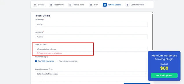
Have you ever tried filling out a booking form and showing an error at the last step? It’s frustrating, right? Your visitors feel the same way.
One small mistake can ruin the chance of a high-intent booking. And that’s exactly where inline guidance and error prevention come in.
No need to drag the client all the way to the end step just to show errors. Instead, you can:
- Highlight missing information in real time with error validations.
- Use clear instructions for date, time or required fields.
- Offer format hints for phone numbers, emails or special requests.
BookingPress makes this easy. You can set required fields, validation rules and helpful tooltips right in your booking forms. This way, your clients know what’s expected and what to fix.
Small touches like this make your booking site feel approachable while avoiding errors before they happen. By using inline guidance and error validations, you can ensure,
- Clients move smoothly to the end of your booking process.
- More completed bookings without extra follow ups.
- Faster completion time with close-to-no errors.
- Boost user experience.
- Lower booking form abandonment rate.
Pro tip: Combine inline guidance with friendly human-like messages. Instead of “Invalid input,” try “Oops! Please check your email, It looks like there’s a typo.”
Strategy 6: Prioritize a “Mobile-First” Responsive Design
These days, most people browse and book services right from their smartphones. If your booking website looks great on a desktop but is a nightmare on mobile, you’re losing more than half your potential bookings.
That’s why create a mobile-ready booking website.
A mobile-first responsive design makes sure your website adapts perfectly to any screen size, from smartphones to tablets to laptops. Buttons should be easy to tap, forms easy to fill and calendars scroll smoothly without pinching or zooming.
The payoff? A mobile first approach makes your booking experience:
- Lower friction.
- Encourages users to complete their reservations on the go.
- Helps you capture bookings from every device.
- Speeds up checkout in just a few clicks.
- Improves customer satisfaction.
In simple words, a mobile-first approach turns a clunky, pinching, and zooming mess into a smooth on-the-go booking experience.
Strategy 7: Provide Immediate Feedback & Confirmation
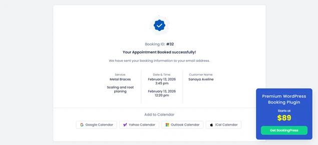
When a customer already booked your service and doesn’t receive a confirmation screen, its red flag. That destroys the complete trust you built by providing a smooth booking experience.
That’s why you must let your visitors know immediately that their booking was successful, what to expect next and how they can reach you if needed.
Here’s what to do to never make your client unsure of an appointment:
- Redirect clients to a confirmation page summarizing their booking details.
- Send an instant email or SMS confirmation notification.
- Show visual cues like a checkmark or in-built “Booking Confirmed!” message right after the booking form.
BookingPress lets you automate this complete step seamlessly. Once a client completes their booking, it shows a confirmation message right away on the booking form.
Best of all, you can smooth two-way sync bookings across popular calendars such as Google Calendar, Outlook Calendar and Apple Calendar, making sure everyone stays on the same page.
Plus, clients who booked get automatic notifications as well, confirming booking via WhatsApp, Email, SMS and Telegram. Absolutely, you can customize all these notification messages with a personal touch.
Pro tip: Include next steps in your confirmation such as links to prepare for the appointment, directions or add-to-calendar buttons. This not only reassures users but also reduces no-shows.
Conclusion: Time to Delight Your Customers
Your booking website is the place where visitors turn into happy paying clients. So make sure they turn, and turn into actually happy ones.
By using these 7 UX strategies to create a booking website, you can make your client’s booking journey simple, fast and enjoyable. And with BookingPress by your side, you can implement all of them with no hassle.
BookingPress gives your users a seamless booking experience they’ll love, and actually complete bookings. No need to think twice. Make your booking website a place visitors enjoy returning to!
You May Also Like:


Brian is a WordPress expert with a decade of developing experience & technical-writing. He enjoys blogging, movies & hiking.

Get BookingPress Premium
60+ Premium Addons
20+ Payment Gateways
Plan starts at just $89
Get Premium NowLike our insights? Click the badge to add BookingPress as your preferred source on Google.

Add as a Preferred
Source on Google